Designing for a Phone in a warehouse, not a Desk
The interface works in review because review happens at a desk. The user is standing in a warehouse aisle, in gloves, with one hand on a trolley and sunlight across the screen.
One Hand, One Thumb, One Glove
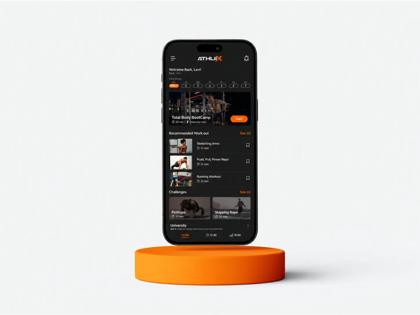
Everything critical sits in the lower third of the screen, and hit targets go well past the 44px minimum — a gloved thumb is closer to 60. Gestures that require precision, and anything needing two hands, are removed rather than refined.
A gloved thumb is closer to 60px than 44px, and sunlight turns comfortable contrast into a defect.
Light is a Constraint, not a Preference
Contrast that reads comfortably in a design review disappears in direct sun. We test on the actual device outdoors, at the brightness the battery policy allows, and treat anything under the threshold as a defect rather than a taste question.
One action per Screen
A picker scanning four hundred items a shift needs one obvious next step, not a menu. Screens in this context are deliberately sparse: current item, expected action, confirmation. Everything else lives behind a deliberate tap.